The Italian Gardens at Trentham Hall
The garden designers inspect Tom Stuart Smith's makeover of this 19th century landscape.
Saturday 6 March 2010
general
It was as you will see a gloomy, blustery day which my 'point and snap' did not love! However, as I walked and was blown around I felt like The Sun King! It did not however feel like that at the start.
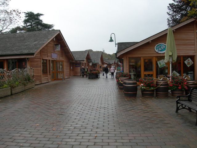
The entrance to the gardens at Trentham Hall had been rather unexpected and somewhat downbeat. You pass from car park to garden via a retail village with piped music and synthetic scents of candles and soap. No doubt this is financially necessary, but it is distinctly depressing.
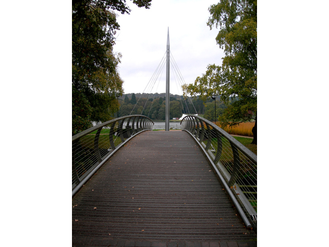
The way is not immediately clear and then, Narnia - like, as though escaping through the fusty fur coats of the eponymous wardrobe, you cross a contemporary bridge into a wide, lakeside landscape. Fresh air!
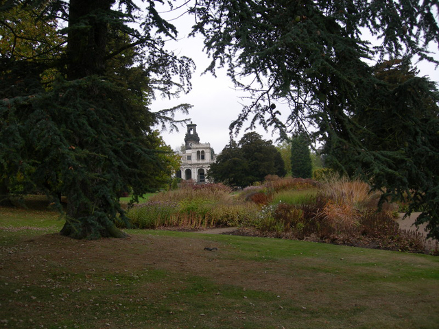
The Piet Oudolf Grassland and Perennial Maze successfully draw you forward and suck you along towards a grim and forbidding tower, which reminds you of The Turn of the Screw. For sure, the ghost of Peter Quint might be glimpsed, framed up there against the leaden sky.
These Oudolf gardens are well worth the seeing in their own right. The bold use of space, flow, line, mass, contrast and harmony are what we expect of the Master and they are here, but they are not what you have come to see.
Turning sideways you find yourself on the garden front of what was once one of the stateliest of England’s stately homes -at least you would, if most of it had not been pulled down, completely unwanted, in 1911. So there IS a ghost here. A mansion belonging to the Dukes of Sutherland, once so vast and so richly appointed that it received visiting monarchs, is now simply registered by a space.

To the left there is a ‘shock and awe’ moment as you take in the immensity of an open landscape at which gods like Bridgeman, Capability Brown, Barry and lastly Tom Stuart Smith have all had a go. At first it is formal for say 70 metres, then formal, but these days, billowingly perennial, for 250 metres and finally a mile long lake takes you to the horizon.
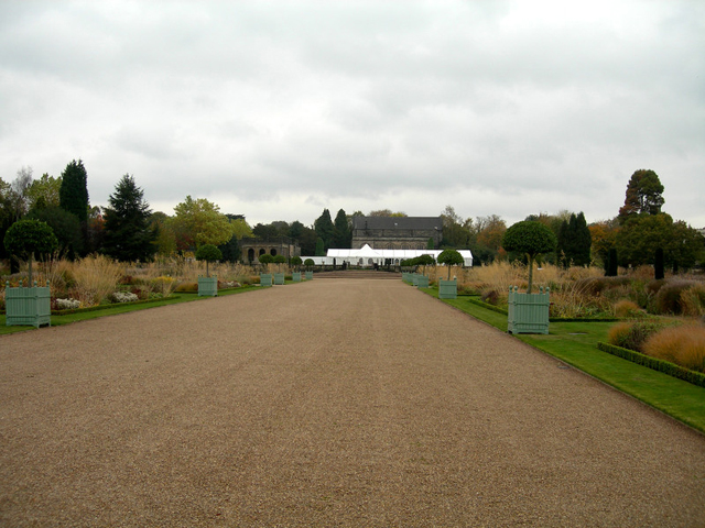
The mansion’s demise means that there is, at the centre of the landscape, a palpable and poignant emptiness. Versailles without the palace! A stark white, commercial, wedding-venue tent doesn’t exactly fill the physical or cultural gap and looking back from the lake it is a discordant note. The house and garden, as last reconstructed by Barry in the 1840’s, were of an italianate piece.
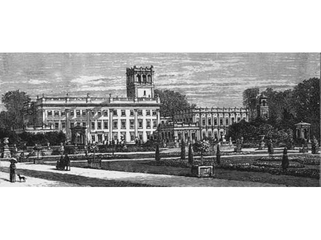 The garden would have been a richly patterned carpet to be viewed from the upper windows of the house and definitively from the 100 foot campanile tower which was a focal part of the building. While this formal garden linked the house directly to the lake it was also a very effective statement of cutting edge fashion, immense wealth and sheer power.
Already feeling rather arbitrary, plonked down on the edge of a picturesque landscape, this status symbol was planted up with greenhouse blooms at least three times a year. We are very familiar with council ‘bedding out’, but in its heyday this must have seemed shockingly novel.
It was also phenomenally expensive to run and was subjected to ducal cost cutting measures within several decades of its implementation. During the rest of the century the Barry pattern gradually became paired down and its constituent elements significantly more shrubby. Does it therefore make sense now to rework it more ambitiously, without the all important house - albeit in cheaper, but more contemporary, perennials? Well, possibly, and possibly not. There has, for some time, been talk of rebuilding Trentham Hall as a luxury hotel, on the same site. It should have opened in 2008. Now the projected start date is 2011. But with, planning, heritage, operational and recessionary hurdles to jump through, who knows? Unless it is rebuilt, the immediate focus of this part of the estate is lost.
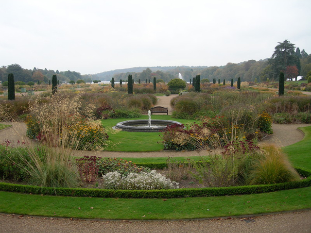
Moving from context to detail, while the Upper Flower Garden certainly feels authentic and is seasonally bedded out, further down there have been substantial changes to the pre existing landscape which allow more depth and expanse for perennial plants-too much possibly? Space is after all a design commodity in itself.
Certainly the floor plan is unlike old aerial photos, prints, and what I take to be Barry’s original thoughts. The latter were at once less linear, more centred and flowing in a way which might better have suited Tom Stuart Smith’s purpose.
I was intrigued to read Charles Quest Ritson in the Garden Design Journal for March 2008: ‘And this is the clever bit: Tom Stuart Smith designed his makeover in such a way that at any time the plantings can all be quickly removed and Trentham restored to its original 1840 structure.’ So presumably some future Tony Robinson and attendant Time Team could weigh in with trowels and find in the soil profiles some traces of ancient beds and borders. All is well then! Do we design on this basis? This suggests that someone could be less than convinced this is the way forward. Certainly in ‘The Garden’ for December 2005 Chris Young raised the hoary spectre of maintenance.
Charles Quest Ritson calls it a parterre. Can a parterre be planted with specimens which grow en masse to 2 metres plus? I admit to some ignorance on this point. I had assumed that a parterre meant par terre and the height of the plants IS the big issue. ‘The architectural structure is so strong, it allowed me to get away with a mush of planting,’ says Tom. Well, not really.
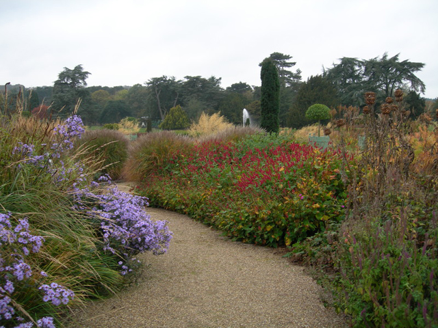
The areas where the plants work best are the low plantings on the upper levels and once you are off the terrace and upper garden the billowing fullness of the plants makes you lose all sense of the pattern.
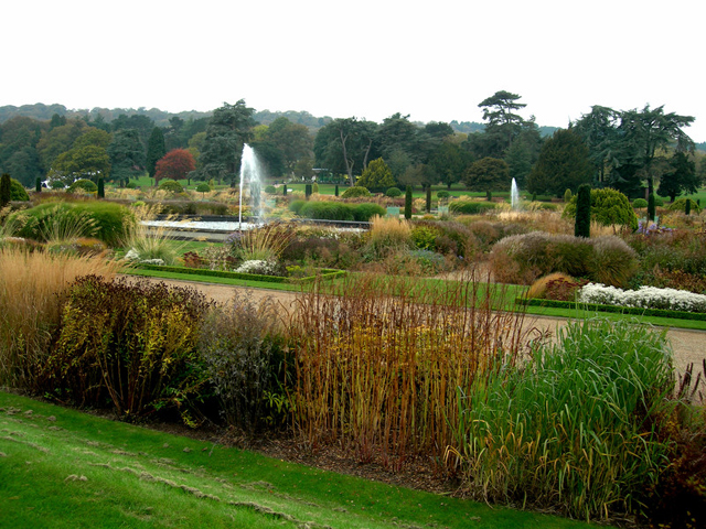
You look then for the punctuation points of umbrella laurels in Versailles planters, fastigiate yews and fountains to restore visual order. Otherwise it becomes a wide open sea of perennials- a beautifully tawny sea at this time of the year, but a sea none the less. There are also not enough tall fountains to balance against the height of the perennials. As it is now, some viewing height is essential, and a rather impromptu wooden platform, where the house would be, is a distinct if inelegant plus:
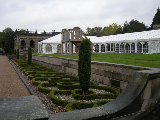
The danger with this sort of design is also that one starts talking statistics-distances in hundreds of metres and numbers in tens of thousands of plants. Some of the borders are very long-Piet Oudolf’s side borders for example. After a little while of walking, the border combinations become a bit ‘so what?’ The point about bedding plants is that one can and did use hundreds of them en masse to make a simpler, more cohesive statement which could be absorbed. Now, we know that 50,000 red pelargoniums are a no no. But, could the grandness of line and space, which is the fundamental point, not be got with gravels, grass, mat forming perennials such as ophiopogon or carex and fastigiate shrubs? Certainly the pattern would be easier to achieve.
Looking at the larger picture, does it even make sense for there to be three, albeit three pretty phenomenal, perennial gardens side by side? Probably not. But what hurts is the way that all this is presented to us. You are pretty continuously aware of commerce. And how you enter and leave a garden does matter. You would not have entered this landscape sideways in the 1840’s. The stupendous terrace and distant lake would have been a massive, show - off surprise revealed to you by the owners from inside the house. After the build up of the lodges, the drive, the entrance front, the state rooms you had THE VIEW. Today’s visitor needs to have the same feeling, as if it were all of a piece, but I doubt that the guests of the luxury hotel will want hundreds of garden visitors traipsing through for ‘the reveal’ it demands.
A conundrum. But poor old Trentham has been a conundrum now for almost 100 years.
R

